Posts

Showing posts from May, 2018
Image
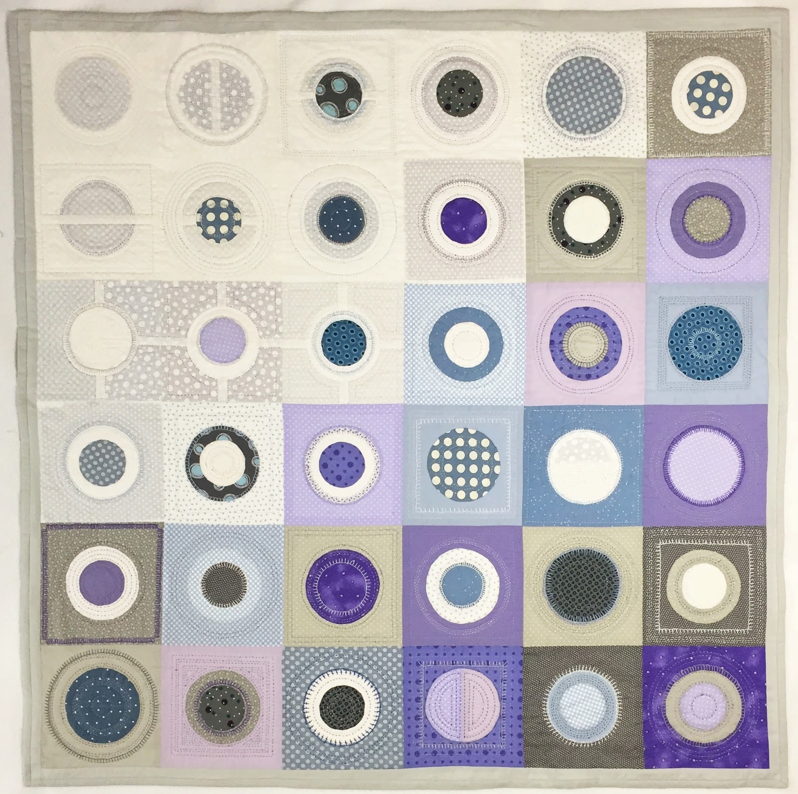
Project Update- Circles 1 "Circles 1" is complete...yeah! It took almost exactly two months to hand appliquĆ© the circles and quilt this wall hanging, which measures 45 inches square... I was inspired by the Needlework show to try something new, (check out the series beginning with the following post, to get up to speed:  http://creativelifesampler.blogspot.com/2018/04/travel-log-spring-2018-2-1-of-5-my.html ) I used embroidery thread and the same embroidery stitch in each square for a bit of embellishment, and lots of practice. The happy result is that the circles have a three dimensional look which I hadn't anticipated.  Now on to other unfinished business... šŸ˜
Image
A Thought for Today Joy is the sweet voice, joy the luminous cloud- We ourselves rejoice! And thence flows all that charms or ear or sight, All melodies the echoes of that voice,  All colors a suffusion from that light. Samuel Taylor Coleridge (1772-1834) (This photo was taken on vacation last year... breathtaking, right?)
Image
And the Colors Multipy   (8 of 8) There are as many ways to present colors as there are reasons to identify and reproduce them. For example, in the computer program Word, color options for text are presented with hexagons building outward from white through the tints into the shades of each of the six colors on the standard wheel. If you're choosing paint, the choices are presented in a strip of gradations in that color family. It's not necessarily that we can't find resources against which we can compare a color in order to identify it. The problem is usually keeping the color in your "mind"s eye" when it's not in front of you, and then knowing when another color matches, complements or clashes with your first color. Notice those three options: 1) matching= exactly reproducing a color. 2) complementing= finding colors that look good together, though they aren't an exact match, 3) clashing= the incompatibility of mismatched colors
Image
The Answer    (7 of 8) The reason these colors don't seem to fit in the natural progression of color around the wheel is that  they are composed of more than the three primary colors. The color wheel presents the pure spectrum of colors (also known as hues ), but when we add white, or black, we are changing their value.   So, when white is added, we have a tint of the pure color (or hue), and adding black, we get a shade of that color.  Let's break some colors down... You are probably familiar with two popular colors: peach and apricot. Side by side, they seem pretty close to each other, don't they?  We know they belong on the warm side of our color wheel and we know that they are lighter than the hues on the wheel, which means they include white. It might surprise you to know that peach is actually a tint of orange and apricot is closer to a tint of yellow orange. Traveling toward red, right around orange red, I would place mango, which is
Image
Color Placement    (6 of 8) Dividing the crayons into general categories, oranges, reds, purples , blues, and greens, I started with sample squares for each color,... In the greens, you can see that there was only one that would have, maybe, fit in without throwing off our gradual progression around the wheel... not much luck with the oranges, but the reds, purples, and blues had a few more possibilities... So,...what's "off" with these colors, that they don't find a home on this wheel?
Image
 What's missing?    (5 of 8) Perhaps you've noticed by now that two standard colors from our crayon box are missing on the color wheel: brown and black. That's because they are made up of more than one color. Theoretically, black is a combination of equal parts blue, red, and yellow, (though in practice it's difficult to mix the black that most of us consider a "true" black.) Believe it or not, you can actually have a "warm" black (called "ivory black") and a "cool" black (called "lamp black"). "Ah!" you say- this explains why it's so frustrating, trying to match those black pants to your favorite black blouse... you thought "black is black". So, once again, it's handy to be able to evaluate whether a color is "warm" or "cool". To understand brown, we have to go back to our basic color wheel, and talk about complementary colors: Traditionally, complementary
Image
Complete Color Wheel?    (4 of 8) Let's take our primary, secondary and tertiary colors, and place them in an expanded version of the color wheel. Beginning with a primary color (yellow, in this example), we would mix a little bit of the next primary color (which is red, as we go clockwise here), until we reach the secondary color (orange). Keep adding red- eventually you will loose all trace of yellow and have a solid primary red. Then you can start gradually adding blue...     The result is a natural progression of color.  Now, take some time to practice examining colors around you. Get comfortable with classifying colors as cool and warm. Ask yourself: "Where would I place this color on the wheel?" You already know your primary colors, so if you have a blue, for instance, is it on the green side of blue or the violet side? How close to that neighbor is it? (If our goal is to maintain the harmonious progression of color around the wheel, be p
Image
Color Wheel Bisected    (3 of 8) If we split the center color wheel in half, you will have two groups. The "cool" colors, on your left, which include green, blue, and purple (or violet). The "warm" colors, on your right- yellow, orange, and red. Think  "ice"and "fire": But notice that there is a tertiary color in both groups that looks like it might not belong with the rest: yellow green at the top on the left side and violet red at the bottom on the right. Because yellow green has the warmth of extra yellow in it, we could move it over to the right with the warm colors and it might be considered a "cool" warm color. Violet red could be switched over to the left side with the cool colors and might be considered a "warm" cool color. If they stay where they are, yellow green is "warm" cool and violet red is "cool" warm... I'm not sure if that's official terminology, but that seems to de
Image
The Classic Color Wheel    (2 of 8) You are probably very familiar with the color wheel, and could easily identify each of these six colors in their purest forms. Slip two colors between each of them, and you will have your  “tertiary colors”.  At the line between green and yellow on the color wheel, there is a green that has extra yellow in it and a yellow that has some green in it. Remember that green is already made up of 50% yellow and 50% blue, so if you add more yellow, you end up with a green that looks like tender baby leaves with the sun shining through them, rather than mature deep green leaves in the shade. The names for these colors can be kind of tricky. In the example above, the color described would be "yellow green".  Think of the first half of the name as the adjective of the second half of the name. So "orange yellow" is yellow with a bit of orange (or, actually, a very small percentage of red), and "yellow orange" is oran
Image
Color Tutorial    (1 of  8) Color is a part of our lives. Adding color enhances, freshens, revitalizes. It can also be a source of frustration, disappointment, or discouragement in the process of making everyday choices. It seems to me that a lot of people think they have no “color sense”. For some, this feeling comes up when trying to match items for the home, or an outfit, and even when choosing fabrics for a quilt. There are just endless situations when this self-doubt could surface. But I think confidence can be bolstered a bit by understanding how color is mixed. So let me share some fundamentals with you. First things first: there are three “ primary colors”: yellow, red, and blue . Think of them as you would primary numbers, they can not be broken down any further to get another color... this is it. When you learn to evaluate how much yellow, red or blue is in the color before you, you will feel more comfortable assessing what other colors will match, complement,
Image
And the Finished Quilt...  (4of 4) "Spring- Summer Sampler" was finished in 2010. It is a king size quilt... very heavy. The blocks measure approximately 11.25 inches square and are set in a 6x7 grid with 2.5 inch sashing. When deciding on each block's place, my goal was to evenly distribute the less successful squares and the simple patterns among the more complex blocks, while balancing the colors throughout the quilt... no small task. And yes, the backing is pieced from the remainders of the fabric from the top of the quilt.
Image
Every Block Serves a Purpose (3 of 4) So when all was said and done (or should I say sewn?), I couldn't help but have my favorites. But even the less impressive blocks serve a purpose. They rest the eye when you scan the quilt. In fact each block plays its part by providing a contrast to the blocks that surround it. And I couldn't resist  including two squares that simply showcased some favorite fabrics- a sampler within the sampler, if you will. 
Image
Color Choices Examined   (2 of 4) There was no system in choosing the fabric combinations for each block in this quilt. Some blocks called for two or three different fabrics and others were more complex, so I just pulled together fabrics I thought would look good together. The result was that some blocks were more successful than others- there was a bit of a learning curve here, I admit it. Blocks that read well from a distance had greater contrasts between the fabrics, so you could see the individual shapes in the pattern clearly. In the examples below, the two outside blocks have 3 different fabrics but 2 of the choices are close in value (though not the same color), that means your eye goes to the lightest shapes and the whole design is lost. In the center square, all you see is the star shape because the choices for the outside shapes were too close in value and the color difference wasn't enough to show the whole design from a distance. Live and learn...
Image
Linen Closet- the Spring- Summer Sampler   (1 of 4) According to my  New Standard Unabridged Dictionary of the English Language  , a sampler is "often worked as a sample of the beginners skill..." It is designed to give one lots of practice and hopefully  demonstrates proficiency upon completion... hopefully. šŸ˜ One of my first sampler quilts was “Spring- Summer Sampler”. I can’t remember now which came first; the idea to try squares from an encyclopedia of quilt blocks, or collecting the fabrics. But, at some point the fabrics in dusty roses and mossy greens became my color palette for this experiment in classic quilt patterns. And this was good practice in making points, lining up seams for straight lines and much more. These are some of the fabrics I started with- I chose the third one for the strips between the squares, (called "sashing"). This fabric's design shows a good amount of warm, neutral background, and includes hints of all the color
Image
Calling for Destination Recommendations In several recent posts I've written that I was making a note of places to go or things to do: Lancaster PA, take a class at the Torpedo Factory, take a class at one of the quilt shows…the implication being that there is an "official list". There is no doubt in my mind that there are all kinds of inspiring, wonderful places for creativity in this great big world. Maybe you know a “must see” destination from your travels, or in your own backyard- an artists’ colony, an exciting art collection, gallery or show- something you always mention when a specific location comes up in a random conversation. I’m starting an "official list" and I’m inviting you to make recommendations. If I end up fitting it in any of my future travel plans, please be sure that I will definitely write about it, especially if it takes me or my work in new directions. Maybe you will inspire me to break out of familiar comfort zones!
Image
Program Notes, a Beach Walk, and Mandalas For some reason, that phrase from the Needlepoint Show program- “a meditative opportunity …” - has given me a lot of food for thought. (see the original 4/26 post: http://creativelifesampler.blogspot.com/2018/04/on-first-page-4-of-5-in-program-for.html ) meditation : continued or extended thought; reflection; contemplation I had been looking at the process of creating as the activity of producing something. I enjoyed the planning stages of a project, the choices of materials, the application of my skills, but my goal was the end result. Asked if I thought I was “meditating” at my sewing machine or with my handwork, I would have answered honestly: not really. Maybe that was because I usually had some kind of background noise going, to “keep me company”. Then again, I get a lot of teasing from some family members about how focused I become in the middle of a project, to the exclusion of all other activities: dishes go unwash