Color Tutorial (1 of 8)
Color is a part of our lives. Adding color enhances, freshens, revitalizes. It can also be a source of frustration, disappointment, or discouragement in the process of making everyday choices. It seems to me that a lot of people think they have no
“color sense”. For some, this feeling comes up when trying to match items for the home, or an outfit, and even when choosing fabrics for a quilt. There are just endless
situations when this self-doubt could surface. But I think confidence can be bolstered
a bit by understanding how color is mixed. So let me share some fundamentals with you.
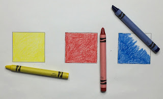
First things first: there are three “primary colors”: yellow, red, and blue. Think of them as you would primary numbers, they can not be broken down any further to get another color... this is it. When you learn to evaluate how much yellow, red or blue is in the color before you, you will feel more comfortable assessing what other colors will match, complement, or even clash with your original color. Color choice can become a conscious decision, instead of a happy guess, or an unfortunate blunder.
Basic yellow, red and blue are the colors from which all other colors are derived. Since we can combine any two of these colors to get a new color, the best way to present this possibility is in a circle:
Color mixing is about percentages, (so you math people should be right at home here). The next colors we will consider are made up of equal parts (50% / 50%) of two primary colors:
And now you have your "secondary colors": orange, purple (or violet), and green.


Comments
Post a Comment