Color Choices Examined (2 of 4)
And some squares were a total flop!
There was no system in choosing the fabric combinations for
each block in this quilt. Some blocks called for two or three different fabrics and others
were more complex, so I just pulled together fabrics I thought would look good
together. The result was that some blocks were more successful than others- there was a bit of a learning curve here, I admit it.
Blocks that read well from a distance had greater contrasts between the fabrics, so you could see the individual shapes in the pattern clearly.
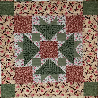
In the examples below, the two outside blocks have 3 different fabrics but 2 of the choices are close in value (though not the same color), that means your eye goes to the lightest shapes and the whole design is lost. In the center square, all you see is the star shape because the choices for the outside shapes were too close in value and the color difference wasn't enough to show the whole design from a distance. Live and learn...
If I chose fabrics that were all on the dark side, from a distance it would read as one big shape, even if the fabrics' colors were very different.Blocks that read well from a distance had greater contrasts between the fabrics, so you could see the individual shapes in the pattern clearly.
In the examples below, the two outside blocks have 3 different fabrics but 2 of the choices are close in value (though not the same color), that means your eye goes to the lightest shapes and the whole design is lost. In the center square, all you see is the star shape because the choices for the outside shapes were too close in value and the color difference wasn't enough to show the whole design from a distance. Live and learn...
And some squares were a total flop!
But that doesn't make them unusable...


Comments
Post a Comment