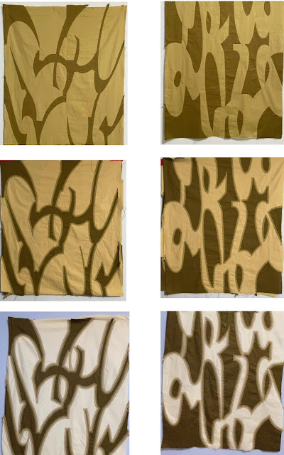
Side by Side Comparison
Thought I'd share a sneak peek at what I've been busy with lately.
I chose an earthy green as the starting point in this experiment and worked on both of these designs at the same time. The darkest green was placed on top of a slightly lighter green in each instance.
The one on the left is appliquéd, meaning that dark green shapes were cut out and sewn on to the background color. The piece on the right is reverse appliqué. The dark green is the background, but it is still placed on top of the lighter color. The difference is that holes are cut into the background in the desired shape and then tacked down, revealing the color underneath.
When they are put side by side, it shows the development of the two appliqué techniques. You can also see the interesting effect that was shared in my last post; the image becomes "blurry" as several outlines of increasingly lighter green are added to the shapes in each piece.
It may have been unplanned, but it is a happy accident, . . .
😏


Comments
Post a Comment