A Quilt Critique (2 of 3)
A Critique (2 of 3)
Thought I’d take some time to comment on this project.
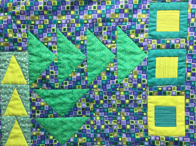
My “inspiration fabric” was patterned in squares of cool colors and it seemed natural to plan a quilt with framed squares to mimic the fabric.
But, I had just completed a baby quilt of Flying Geese. So, I thought maybe it would be interesting to pull what I had learned with that pattern into this new project. (see this link: https://creativelifesampler.blogspot.com/2019/03/flying-geese-for-baby-this-quilt.html) It was an opportunity to get more practice creating Flying Geese. These triangles range from about 7.5 inches high to about ¾ inches, and the squares have similar proportions.
The selection of fabrics I start with included what I thought was a yellow green solid that matched a green in the inspiration fabric. As the project developed, I needed to get some other lengths and, in the absence of swatches, I chose another bright green. When I returned home I found that, in comparison, the first fabric was just plain yellow. By this point it was so incorporated in the blocks that there was no turning back.
It was a happy mistake in the end. The color palette was on the dark side and definitely needed a lighter color for contrast. (A few of the fabrics had hints of white, but I don’t think solid white shapes would have worked as well. It’s certain that any white accents would create a totally different look.)
Thought I’d take some time to comment on this project.
My “inspiration fabric” was patterned in squares of cool colors and it seemed natural to plan a quilt with framed squares to mimic the fabric.
But, I had just completed a baby quilt of Flying Geese. So, I thought maybe it would be interesting to pull what I had learned with that pattern into this new project. (see this link: https://creativelifesampler.blogspot.com/2019/03/flying-geese-for-baby-this-quilt.html) It was an opportunity to get more practice creating Flying Geese. These triangles range from about 7.5 inches high to about ¾ inches, and the squares have similar proportions.
The overall feeling you get from this quilt, reflects the
method of its creation. It’s kind of a mishmash of shapes and sizes. It might feel even more “haphazard,” if not for the underlying grid of
the square fabric which holds the elements together. One thing that I didn’t anticipate was that, when I rotated some blocks, the squares were completely off the gridding of the rest of the background. Oh well.
The selection of fabrics I start with included what I thought was a yellow green solid that matched a green in the inspiration fabric. As the project developed, I needed to get some other lengths and, in the absence of swatches, I chose another bright green. When I returned home I found that, in comparison, the first fabric was just plain yellow. By this point it was so incorporated in the blocks that there was no turning back.
The yellow and green sided by side.
It was a happy mistake in the end. The color palette was on the dark side and definitely needed a lighter color for contrast. (A few of the fabrics had hints of white, but I don’t think solid white shapes would have worked as well. It’s certain that any white accents would create a totally different look.)
You can be the judge of whether or not it all works together.
Note: It turns out that the Flying Geese pattern is really popular right now. Browsing in a quilt shop recently, I found this bolt of fabric. You know it's trending when they print a quilt pattern on fabric for quilts… LOL!


Comments
Post a Comment