Monday's Quilt Project Update
Monday's Project Update
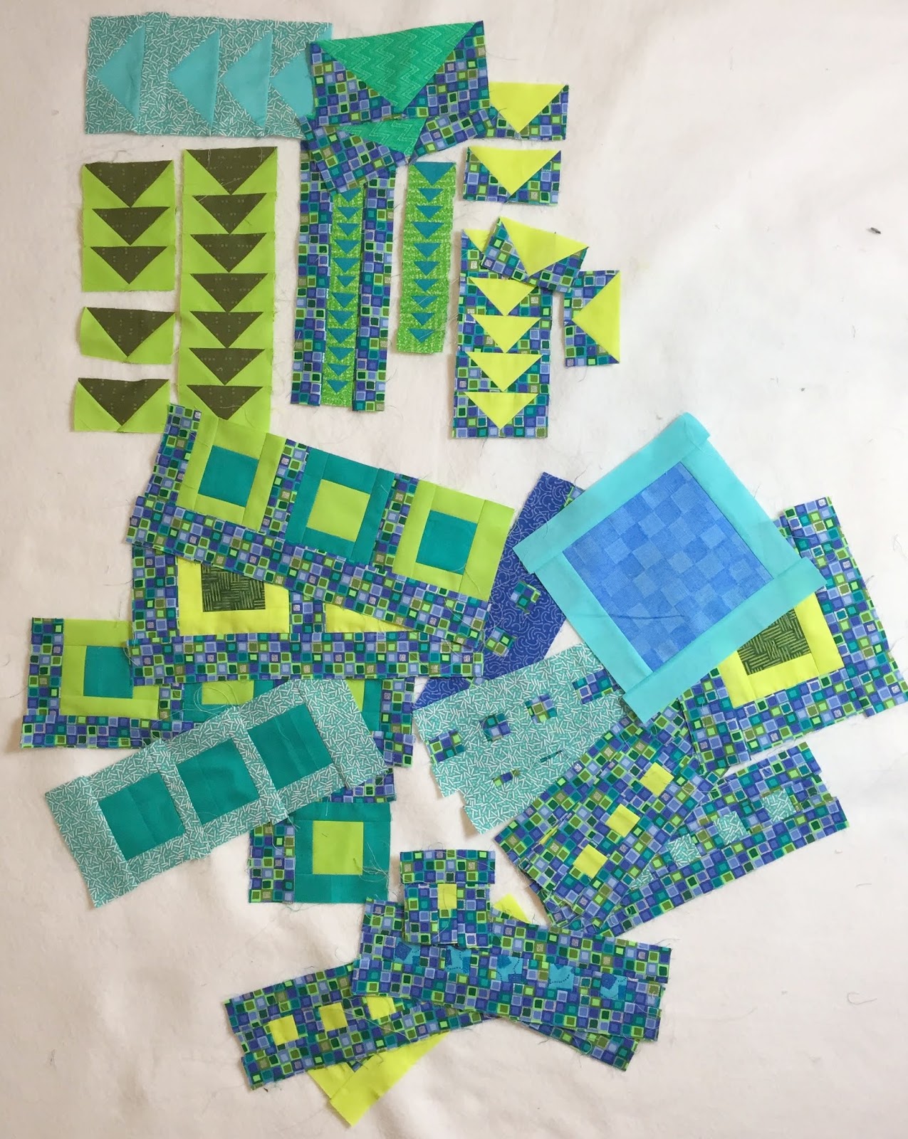
I've been experimenting with scale as I mix and match my fabrics, reducing and enlarging the Flying Geese pattern and squares for variation. (Aren't those baby Geese at the top cute?)
My units are multiplying, but because of their size differences, the units have very different finished dimensions. The challenge in the future will be pulling them all together. I'll cross that bridge when I come to it. Right now, I'm still having fun playing with all the possibilities of color and size.
I have run out of some of the fabrics I started with,... should have seen that coming. So, I have been integrating new solids and a few square themed patterns, by combining them with some of the original fabrics.
Now that I look at the picture above, I do seem to be leaning heavily on the lime green/yellowish fabric. That is something to watch. It's one thing if that is a conscious choice and another to be surprised with a look you didn't anticipate!
I always find it helpful to use photography as a detached "eye". The photo is one step removed from the item that has been photographed. When I look at the picture I am accessing whether or not it appeals to me. Somehow it impersonalizes the process and I can look at my work more objectively. It's as if I'm saying "Ah! That's how other people will see this! Is that how I want it to be seen?"


Comments
Post a Comment